
Rewards Programs in Airline Mobile Applications
Carson Monroe | 04/11/2022
Introduction
As an iOS and Android development agency, we often see opportunities to bring value to different sectors. In this post we’re sharing our exploration of the commercial aviation industry, and the results of our investigation and work. While there are a broad spectrum of airline apps in both Google Play and the Apple App Store, they share many of the same features and user stories between them. We chose to focus on Southwest Airlines as they offered a robust rewards system and a credit card that can reward additional points, but we feel our solutions can be applied to any airline with a similar program.

A review of the Southwest mobile apps show that very little screen real estate is dedicated to their Rapid Rewards program. Points values are displayed in one small box on a user account page and there is no indication of the value of those points, or how many points you have earned on previous flights. Tapping into a dedicated Rapid Rewards section shows progress towards additional benefits, but for a less active flier these progress rings represent an unrealistic goal and take up valuable space.
After assessing the current app, we gathered goals that we wished to achieve in a redesign:
- Maintain key information such as Rapid Rewards account number and rewards points value
- Promote flights that fall within a user’s rewards points
- Promote additional flights that are above a user’s rewards points or are on sale
- More prominently display users’ previous trips and how many points they have earned from them
To best achieve these goals, we started by separating out the most essential sections. This would allow for simpler navigation and a cleaner user experience. We also designed a rewards icon that would be used extensively throughout the UI, making it easier for users to identify values and compare them to their own balance. Finally, we included existing promotional banners to ensure that marketing and advertising goals were still met.
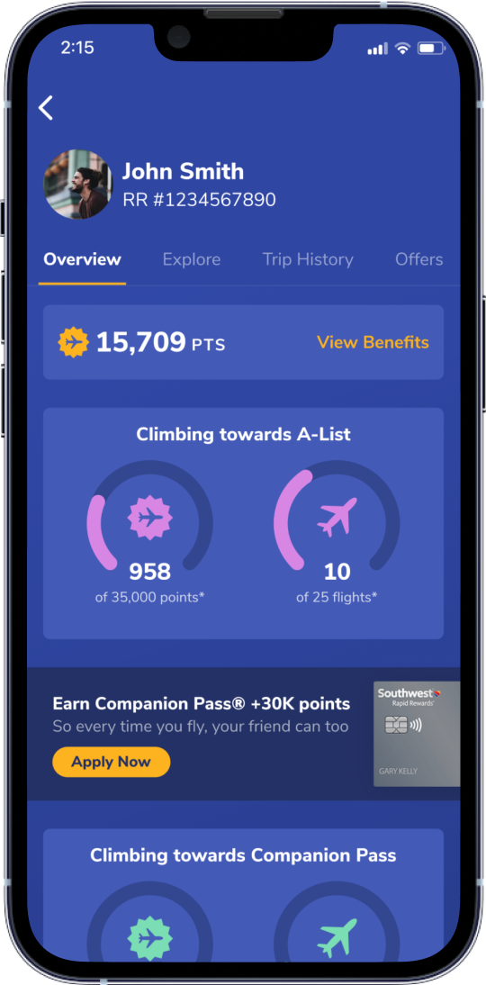
Overview Section
The overview section contains existing promotions run by Southwest, as well as valuable information for users. This includes Rapid Rewards account number, Rapid Rewards value, Southwest credit card advertisement, and progress towards A-List and Companion pass.
Explore Section
The explore section lays out destinations on a map, making it quicker and easier for users to browse and hunt for the best deals even without set plans in mind. A filter defaults to deals that fall within a user’s rewards points but can be edited to include additional deals and trips outside of their points value. Cards below the map add visual interest and offer an alternative way to browse destinations.
Trip History
The overview section contains valuable information for users, as well existing promotions run by Southwest. These include Rapid Rewards account number, Rapid Rewards value, Southwest credit card advertisement, and progress towards A-List and Companion pass.
Offers
On the current Southwest app, there is a section for “Offers” which is essentially a screen with banner ads. While a minor section, it was included to maintain current app requirements and redesigned to follow the look and feel of the redesign.
Look and Feel
Navigation
The existing app provides only 2 screens dedicated to Rapid Rewards. Our redesign adds 3 additional sections, but utilizes a sub-navigation without overcrowding the page or confusing users. Sections are separated neatly while still being one tap away from main sections of the app. The structure of the nav can also accommodate any new sections with the addition of a horizontal scroll.
Map UI
Map-based navigation is ubiquitous in modern apps. Showing flight destinations on a map allows users to explore options more effectively and feel more connected to the location. The detail cards below the map offer a variety of options and create a more functional, flexible page.
Visual Design
Our redesign focused mostly on UX and architecture, but small steps were made to update the current Southwest interface and contribute to the overall brand. The existing app utilizes high contrast and information-dense containers that provide little hierarchy. Our color palette uses shades of the Southwest blue for a majority of the containers, putting emphasis on accent text and colors. Additionally, we improved the typography to focus attention where it is most important.

Conclusion
This analysis and design exercise was a great way for our team to bring new to life to overlooked areas of travel apps. Boarding passes and booking screens are very similar across companies, while rewards systems are often overlooked and create an opportunity for a company to stand out. These enhancements were applied to Southwest in particular, but we feel confident that they can be applied to nearly any airline and even other industries. We are excited to iterate and improve on these designs and look forward to working directly with an airline in the future.