Depth & Space
03/11/2012
When I get into the interaction design of an app there’s several things I begin to explore right from the beginning. One of those things is how I can use depth and space to expose or support interactions. I essentially break things down into three levels of opportunity:
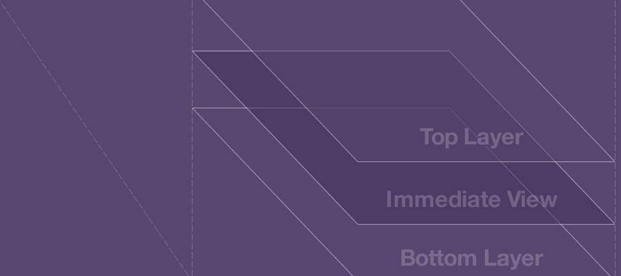
The immediate view of the application. That is, what is immediately visible on the screen in a given state. Most of the time you may have primary features, navigation, etc. represented at this level. It doesn’t always have to be this way though. You can also display visual clues to access major functions of the application.
What is above or below the immediate view. This is where depth and layering come in. Remember, you’re dealing with a digital display, which means pretty much anything you can dream up may be possible. So, what slides in, reveals from under a tab bar, fades out, scales over, etc.
What is outside the immediate view. This is anything that conceptually takes up space outside the boundaries of the screen.
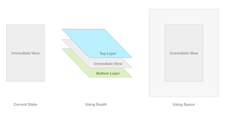
Each of these levels is representative of how we perceive things in physical space. However, since we’re working within a digital medium, there’s opportunities to bend the rules a bit, but still have things feel familiar. I’m sure you’ve already seen these tactics used in some popular apps. Let’s take a look at a few examples:
Pull to Refresh
By using layering, a message to refresh a view is displayed as a user pulls down on a list. The appearance is that this “Pull to Refresh” message is always around and exists under the top navigation bar.
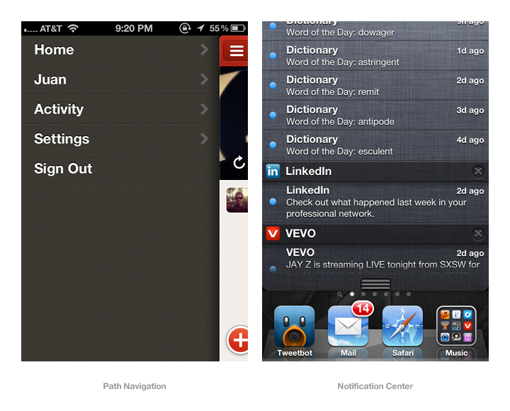
Reveal Navigation
Path, Facebook and Highlight provide an example of using depth and space to reveal the navigation for the application under a main view. The navigation exists under the main view and the main view slides outside the immediately visible space to reveal that navigation. Path bends the “physical” rules a bit by displaying different navigation depending on whether the main view is pushed to the left or right.
Notification Center
The tray that is displayed when swiping down from the top of your iPhone layers on top of the immediate view and appears to slide in from the space above that view.
These are great examples of ways to take advantage of the levels I described. By thinking about depth and space, there’s more room to work with, which can come in pretty handy, especially when designing applications for smaller screens.
A great way to explore these concepts is to get away from the computer screens and get into the physical space. I usually do this with paper, so I can fold, bend, flip, stack and curl my paper interface to discover new ways of using depth and space within my designs.