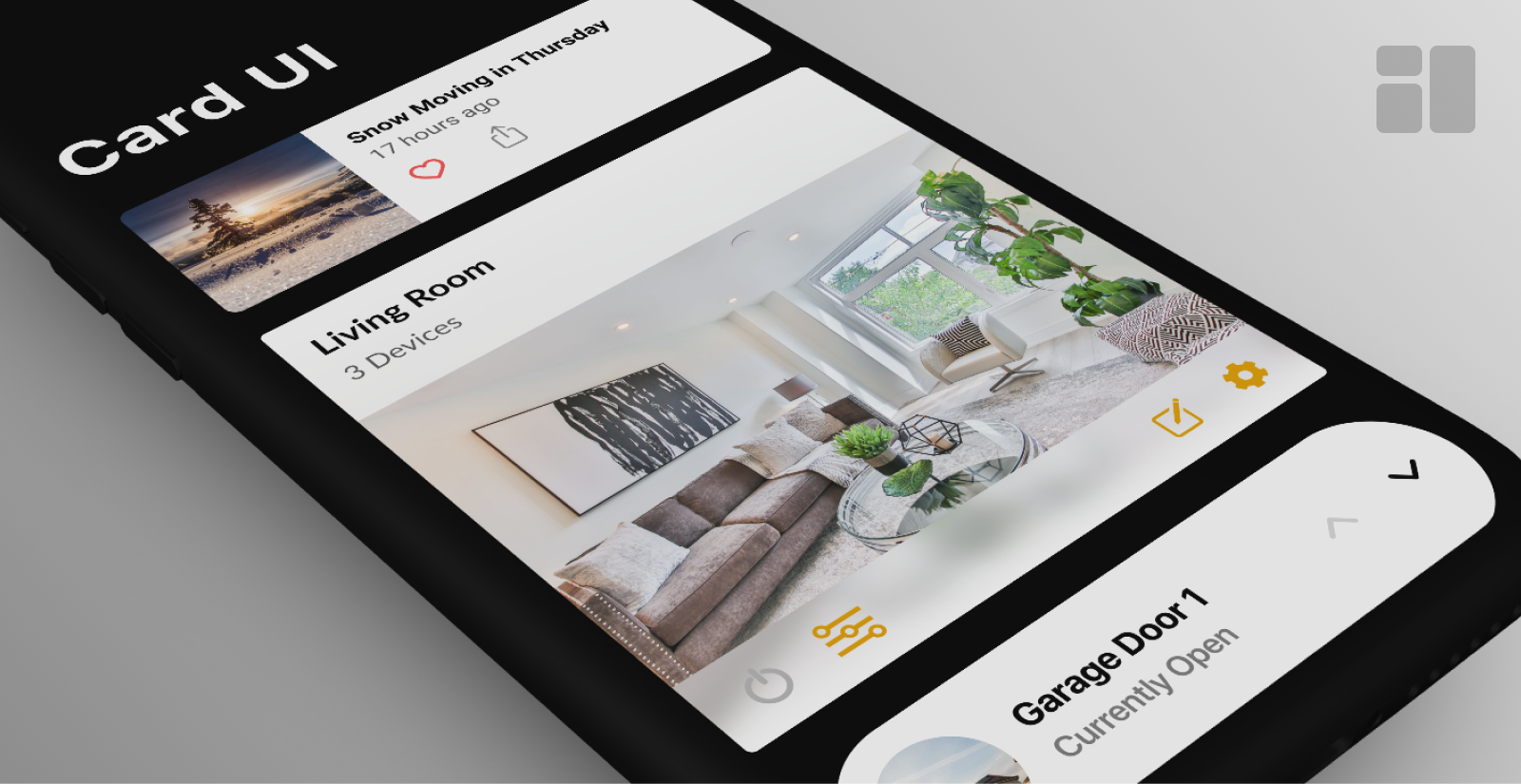
Card Components in UI Design
Carson Monroe | 04/13/2020
The “card” is one of the most common UI elements in app design today. While cards can visually look very different across apps, their content and functionality varies greatly. Our design team wanted to study some common themes and key differences to get an idea of how we can better design our own cards.
We defined a card as a visually distinct container intended to present the user content. With some functional and visual boundaries set, we began to find examples from apps across a variety of different categories. This allowed us to understand the different ways cards are used and what essential actions we need to be prepared to design for.
News & Multimedia Apps
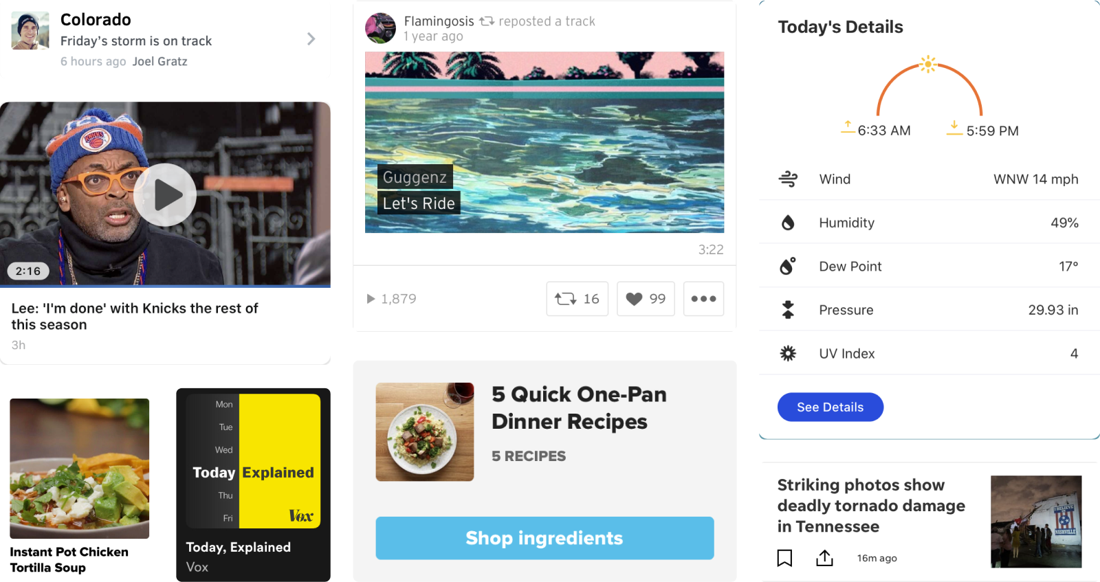
These apps put a heavy focus on visual media to attract users’ attention. While some have information directly on the card, the overall objective is to get users to view additional content by tapping the whole container. Direct calls to action via a button or text link are minimal and space may be conserved to add a row of icons for further interaction.
Social Apps
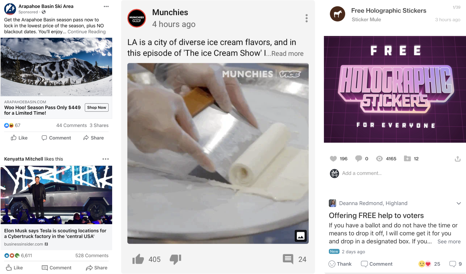
Cards in social apps tend to present more information and offer richer ways to interact without leaving the current screen. Their objective is to allow users to browse or scan while still maintaining a general understanding of the content. Structurally these cards are all very similar, with the main elements being a title, a photo or video, a text description, and a row of interactive icons or buttons. Care must be taken as a designer to designate a sufficient tap area around some of the smaller elements inside the card.
Smart Apps
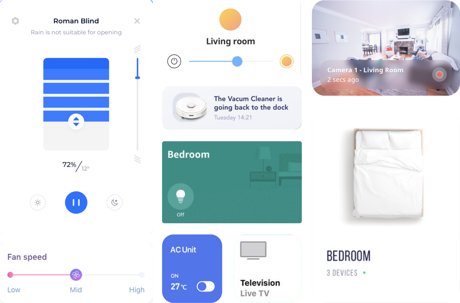
We defined a smart app as any app that is used to control or modify hardware such as a speaker or group of home appliances. The cards within these apps vary greatly in size and design. The most common theme among them is a clear title to identify the device, the function, or the room in which the devices exists. Many cards include UI controls directly on the card, while others act as an entry point to another screen with further controls.
Creating Card Styles in Figma
Using these observations to guide our designs, our team began to lay out wireframe-level cards in Figma. Using auto layout, a new feature in Figma, we were able to design only a few components that would adjust their spacing automatically based on content. This allows us to modify our card design quickly and easily when working with varying content and functionality.

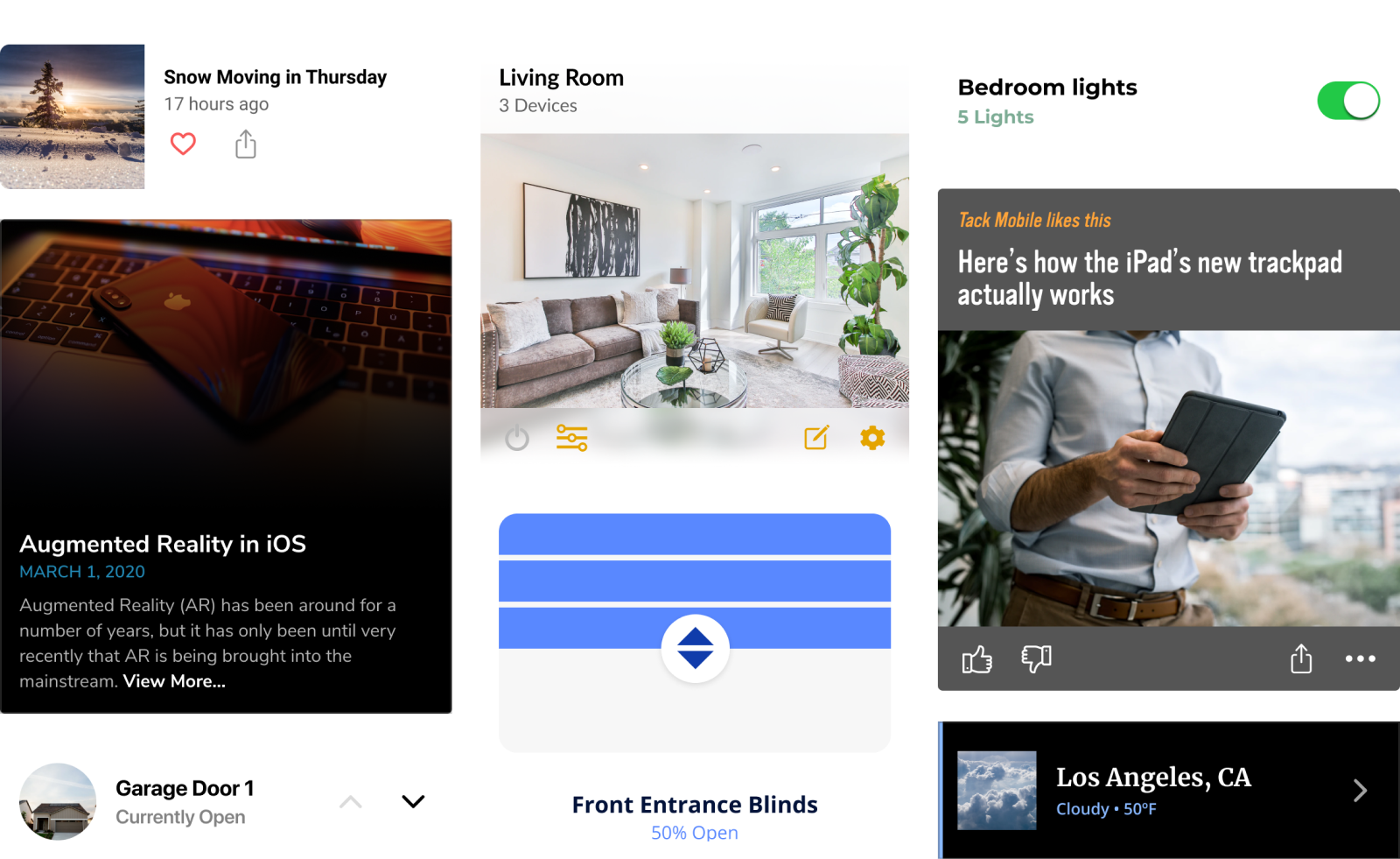
To put our cards to the test, we chose a few real-world examples and applied additional styling. Font styles, icon type, and imagery are all able to be modified while maintaining spacing and keeping the connection to the base component.
Conclusion
This exercise helped us to design more effectively in a number of ways. By first defining and identifying cards, we got a better idea of what this design pattern looks like across industries. It also allowed us to make some assumptions as to what actions users are expecting on these cards. These observations left us with plenty of guidance to design with a flexible library of cards that will save us time and research in the future.
If you’d like to check out our library or use the components in your own project, view the Figma file below.